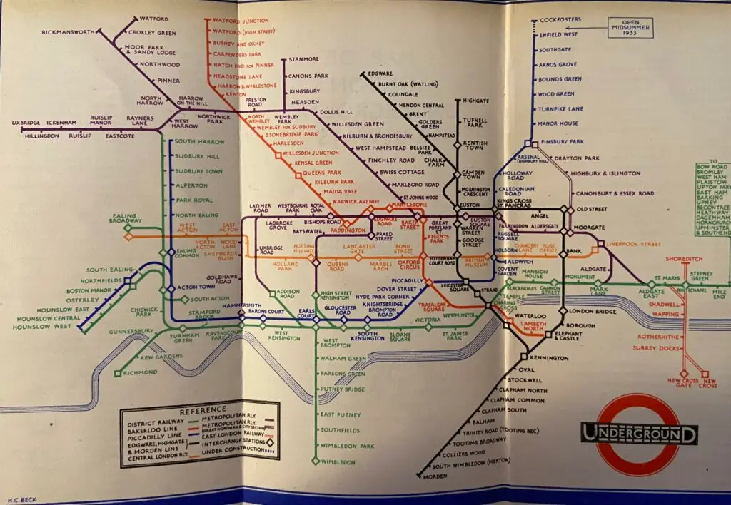
Harry Beck’s 1933 design of the London Underground map revolutionised urban navigation, transforming it from a chaotic tangle into an intuitive tool that anyone could use. It became the blueprint for simplicity and has been copied and mimicked many times since.
In my personal collection, I have a series of Underground Maps from across the decades and the transformation from the late 19th century ground level maps with what looks like colour pen drawn lines over the top of the road plan, to the clarity of the Beck map is a fantastic example of simplifying complexity. While changes and upgrades have happened since, nothing beats the clarity, purpose and focus of the original leap.
In the world of data and analytics, businesses are tasked with navigating an equally complex landscape. Beck’s map offers valuable insights into the principles of clarity, focus, and user-centred design.
Prioritising What Matters: Insights Over Information
The pre-1933 Underground map contained all the information that users needed to navigate their route. Nobody ever questioned that. The challenge was that it was overloaded with details that were distractions and hampered understanding. Geographic accuracy, while valuable in certain contexts, only made the map harder to use for those just trying to reach a destination.
Beck’s genius lay in recognising that what mattered most was not literal representation but clear, accessible routes. Beck’s map became iconic because it highlighted only the essential: colour-coded lines for easy navigation, standardised angles for simplicity, and visible connections for transfer points. Each feature had a purpose, which ultimately allowed users to plan routes without distraction.
In modern terms, the focus shifted from merely gathering large, complex datasets to finding ways of transforming data and information into practical insights. The priorities are the same; demystify information and data for decision-makers; eliminate unnecessary “geographical” details; and emphasise the clearest path to insight to make the right decisions.
Organisations are surrounded by information and data but often lack the framework to see what matters most. By filtering out noise and emphasising key insights, decision-makers need the equivalent of Beck’s map – a guide to navigate the data landscape, see the direct connections, and recognise the patterns that drive business results.
Building User-Centred Solutions
Beck’s map succeeded because it was designed with the end-user in mind. By prioritising usability over technical details, he transformed a complex system into an accessible tool for millions. Similarly, a successful data strategy must be rooted in the needs of its users.
Organisations often grapple with data solutions that are technically sound but fail to resonate with the people who use them daily. To avoid this disconnect, it’s essential to start by understanding the specific needs, challenges, and goals of the end-users, be they decision-makers, analysts, or front-line employees. They need the equivalent of the Beck map, with an effective framework that filters out the noise and emphasises key opportunities and insights, to provide a guide to navigate the landscape, see the direct connections, and recognise the patterns that drive results.
This needs to start with the user and cannot be truly effective if is undertaken at a helicopter level or directed from a single node within the business, such as relying solely on the perspective of the technical teams.
- Engaging with Users Early and Often: Involve stakeholders from different levels of the organisation in the planning and design process to gather diverse insights.
- Simplifying the User Experience: Present data in a way that is intuitive and easy to navigate, much like how Beck simplified the Underground map with clear lines and symbols.
- Iterative Design and Feedback Loops: Continuously refine data tools and platforms based on user feedback to ensure they remain relevant and effective.
Scalability and Adaptability
Beck’s design remains relevant nearly 100 years later, even as the Tube network has expanded and evolved. This is because the underlying principles of simplicity and clarity are adaptable, allowing the map to grow without losing its core usability. It’s a model of scalable design—a concept that resonates strongly with data strategy.
In a landscape where the amount and complexity of data is continuously growing along with the number of panaceas available, strategies must be scalable. We need to structure our solutions with an adaptable framework so that, as new data flows in and needs evolve, the system retains its clarity and functionality. Just as Beck’s map accommodates new stations and lines without sacrificing its usability, a good data strategy must incorporate additional insights, data streams and capabilities while maintaining coherence and usability.
The Key to Successful Navigation
The Beck map influenced transit maps and designers worldwide because it turned a complex system into something anyone can navigate. The simplicity of its design speaks to a broader truth: clarity and focus are essential to navigating complex challenges, whether in transit or in data strategy.
For us at iSquared, Beck’s map is a perfect analogy for what we strive to achieve. We simplify complexity, helping clients cut through the maze of data to see a clear path towards their business goals. Much like Beck, we emphasise “talking the client’s language,” creating solutions that are understandable, actionable, and aligned with their needs.
Beck’s map demonstrates that simplicity, when done well, is not only beautiful but powerful. It shows that complexity can be made accessible, turning something intimidating into a tool that empowers its users. At iSquared, we apply these same principles, ensuring that our clients can harness the power of their data without getting lost in it. In a way, we’re building maps for businesses, guiding them through the intricacies of data to their ultimate destination: growth and success.
Tim Farmer, November 2024


